Open the economic indicators widget
Start by opening the economic indicators widget, which is available in the workspace (Add widget on the top right).
Genesis Risk Monitor gives analysts a macro workspace where FRED series, yield curve moves, consumer sentiment, inflation prints, interest-rate shifts, and CPI releases can be monitored together inside live market and portfolio workflows.
Instead of copying data between separate tools, Genesis Risk Monitor brings direct FRED integration into a macro workspace built around CPI, inflation, consumer sentiment, interest-rate signals, and the releases that shape market narratives.
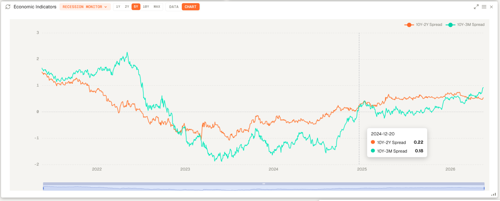
Yield curve analysis is more useful when it sits beside inflation, CPI, and broader interest-rate dynamics. Genesis Risk Monitor frames rate moves as part of a connected macro workflow instead of a standalone chart that has to be interpreted in isolation.
The value is not just seeing the series. It is being able to review FRED data, inflation, interest rates, the yield curve, and consumer sentiment in one repeatable sequence that supports real market work.
Start by opening the economic indicators widget, which is available in the workspace (Add widget on the top right).
Monitor CPI releases and broader inflation trends without splitting the workflow across separate data tools.
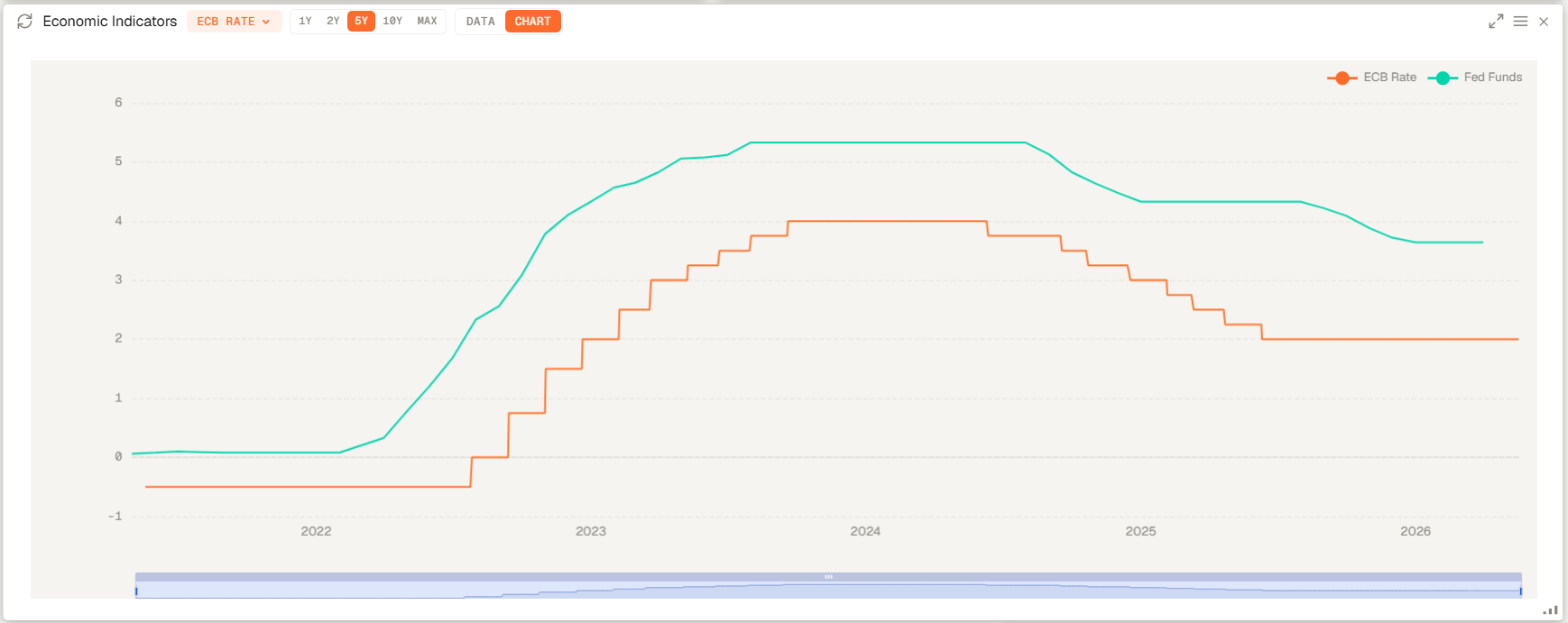
Review interest-rate shifts and yield-curve structure as a connected part of the macro picture.
Review consumer sentiment alongside CPI, inflation, and interest-rate data to get a comprehensive view of the macroeconomic landscape.
These are the practical questions investors and research teams ask when building a macro workflow around FRED data, CPI, rates, and the yield curve.
FRED data refers to economic time series distributed through the Federal Reserve Economic Data service, widely used by investors to track inflation, labor markets, rates, credit conditions, and growth trends from one trusted source.
A yield curve shows the relationship between interest rates and maturity across bonds of the same credit quality, helping investors see whether markets are pricing normal growth, tightening financial conditions, or recession risk. See how yield-curve risk affects fixed income portfolios.
An inverted yield curve means shorter-term yields are above longer-term yields, which often signals tighter financial conditions and elevated recession concern, especially when it persists over time.
Inflation data is more useful when it sits beside rates, yield-curve structure, and sentiment because investors can connect each release to its broader macro and portfolio impact without switching tools.
Explore practical guides on macro data, inflation, rates, and yield-curve risk in investment workflows.
The complete guide to fixed income risk analytics: Duration, Modified Duration, DV01, Convexity, Yield Curve Risk, Credit Spread Risk, and Fixed Income VaR. Understand the tools that bond portfolio managers, fixed income analysts, and risk managers use to quantify, stress-test, and manage interest rate and credit risk.
Discover the 5 types of investment risk every global investor faces today: concentration, interest rate, inflation, liquidity, and systematic risk. Learn how to measure and manage each using professional VaR analytics.
Learn how to measure investment risk and return using professional methods. Understand Standard Deviation, Beta, Sharpe Ratio, Alpha, VaR, CVaR, and Factor Exposure — the complete investment risk metrics guide for assessing investment risk and earnings volatility.
Start with dashboards that connect direct FRED integration, yield curve analysis, consumer sentiment, inflation, interest rates, and CPI inside one platform.